Nonprofit Accounting Basics
Designing a Four Star Dashboard
In a previous article, we described the importance of including multiple internal stakeholders when selecting and implementing an Association Management System (AMS). This principle also applies to the development of reports and dashboards. Before jumping into an Excel sheet or requesting a report from your data analyst, ask yourself: What do I and other staff in our organization need to know and why? You might be excited to play with your new shiny dashboard tool, but before you do, you must be able to answer this and other foundational questions. The following steps provide a framework for ensuring that your approach to reporting is not just flashy, but also effective and meaningful.
Step 1: Align your metrics and strategy
Many nonprofits rely on the knowledge and experience of their team in developing their dashboard. Although this is a good approach the strategic plan should not be ignored. The issue with relying on team experience alone is that what may have been a useful metric in the past or at another organization may not make sense for your organization’s current strategic objectives. It is absolutely critical that every piece of information you invest time in collecting, cleaning, analyzing, and reporting, be related to a goal, objective, or desired outcome of your organization’s mission and/or strategy. We call these metrics key performance indicators (KPIs), and they should be included directly in your organization’s strategic plan. For example:
Goal: Increase young adult literacy in County X.
Objective #1: Improve attendance in courses offered by the center. Attendance = # of students still present at end of course / # of students registered for course. Attendance rate will be averaged across all courses for a semester and compared to averages of previous semesters for the past two years.
Objective #2: Improve Center course completion rates. This will be measured by calculating the number of students receiving a passing grade on the final exam / the number of students who complete the final exam. Completion rate will be averaged across all courses for a semester and compared to averages of previous semesters for the past two years.
The above example from a strategic plan includes several important components. Firstly, it breaks down a goal into measurable components. We call this process "operationalizing your goals". If you can’t or don’t know how to measure your goals, you won’t have any idea if you’ve achieved them! Secondly, descriptions of how each goal will be measured are provided, including the individual data points that comprise each metric and also the context in which the metric will be evaluated (i.e. comparing semester averages for the past two years).
This approach will help ensure that each goal in your strategy can be measured, and will make it very clear which data you need to be collecting. Just make sure you include different organizational perspectives, such as finance, membership, and marketing, when developing your goals and KPIs. Tate & Tryon’s Nonprofit Data Management Checklist can help facilitate a cross-collaborative strategic discussion in your organization.
Step 2: Know your audience
The metrics important to your managers will likely be significantly different than those important to your board and members/donors. It is therefore imperative to consider the needs and preferences of those who will be viewing your reports. Specifically what is their role with your organization? Are they operationally focused or outcome focused? Do they need to monitor daily activities or do they just need the 50,000-foot view? How often do they need to receive a report? Also, what is their background? Are they highly familiar with the organization? Are they data literate? How much context will be needed to understand the report? Finally, what are your audience’s preferences? Do they want hard-copy reports, a PowerPoint presentation, or a dashboard they can open on their iPad? Are they interested in lots of details, or do they only want to see colors? The role, background, and preferences of those who will be consuming your reports are key inputs to the dashboard design process.
Step 3: Apply best practices of dashboard content and design
The dashboard below illustrates some of the characteristics of best-in-class dashboards.
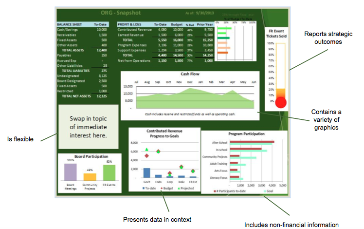
Bear in mind the following principles related to dashboard content and design when creating your reports:
Content:
· Include both financial and non-financial metrics.
· Report on strategic outcomes (refer to the KPIs in your strategic plan!).
· Incorporate context, including to-date vs. budget, to-date vs. projected, chronological trends, and internal and external benchmarks.
· Consider the appropriate level of detail: Is it annually? Quarterly? Monthly? This will depend on the metric itself, your audience, and whether the trend is typical or not. You should “deep dive” on any unusual trends to identify the cause.
Design:
· Whether you use fancy dashboard software or a simple Excel template, ensure that flexibility is built into your dashboard design process. This will make it easier to accommodate unexpected changes in the environment, the organization’s priorities, or your audience’s needs that necessitate a modification to your dashboard.
· Don’t over-complicate the dashboard. Only show the minimum number of metrics and level of detail needed to make a point.
· Use a variety of graphics to make your dashboards pleasing to the eye. Remember that certain graphics are better for displaying different kinds of information. For example, line graphs are best for showing trends over time.
· Automate if possible, this will reduce preparation time and likelihood for errors. There are many great dashboard tools available. Many within the accounting software and others with more advanced capabilities in budgeting and forecasting tools. In selecting one we recommend that it’s one that integrates with the accounting database, is drillable and provides real-time information.
Aligning your metrics with your strategy, considering your audience, and implementing best practices in dashboard content and design, all require extra time and energy. However, the investment will be worth it when you can spot unusual trends early, make operational improvements quickly, and demonstrate impact to your board and members/donors. The world today demands unprecedented transparency and accountability from nonprofits, and dashboards are a key means of communication between an organization and its stakeholders. It is therefore imperative that nonprofit leaders take the time to develop meaningful, accurate, and timely reports.